Opening soon · 108 components in 11 categories
For the projects you want
people to remember.
Each component is designed with care to give your product a premium touch. Tune it to fit, then use it in any stack.
Opening soon · 108 components in 11 categories
Each component is designed with care to give your product a premium touch. Tune it to fit, then use it in any stack.
Every setting is a slider. Change one and the preview and the code update together.
Some favourites from different categories, running live. When the library opens, each one gets its own page where you can tune it and take the code.
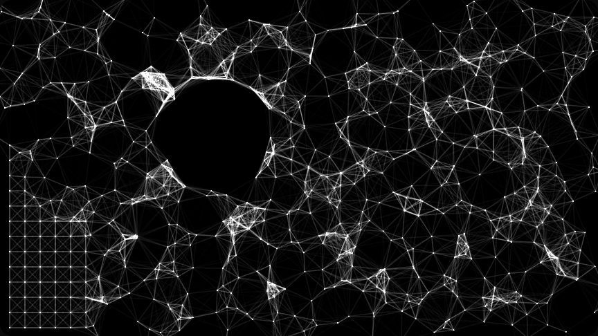
A tidy grid of linked points that the pointer scrambles into a tangled web, then heals.
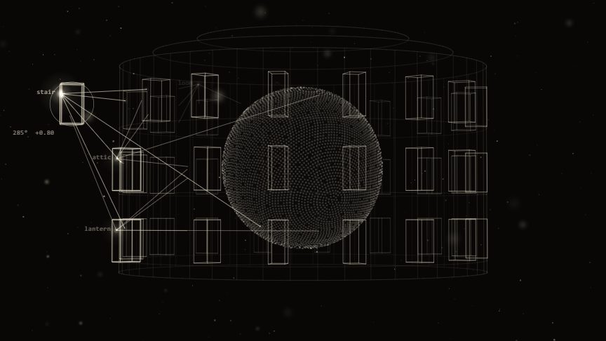
A sphere of dots turning inside a drum of named rooms that light up as they pass.
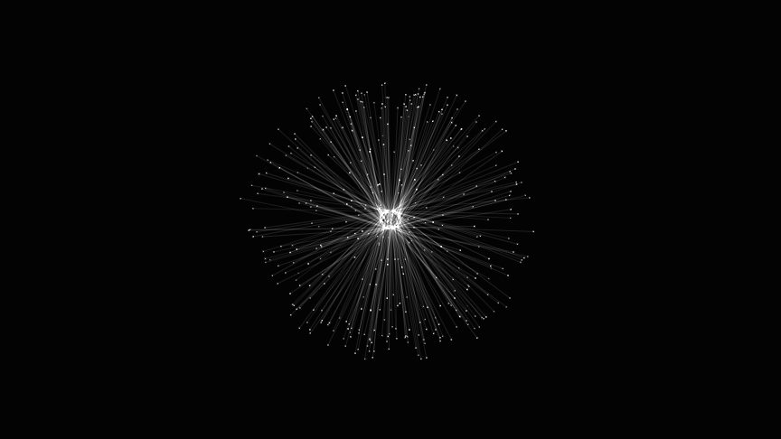
Fine rays spring from a tangled core, each tipped with light, swinging slowly in depth.

Soft bands of teal and mauve drifting across the page in a crisp retro dither.

Filaments of light swirl through the dark; the pointer heats them and drags the flow along.

Waves of light rolling across a grid of tiny tiles, pulled along by the pointer.
Whatever you build with, the component comes ready for it: code for your framework, a prompt for your assistant, or a still for your design file.
React, Vue, Svelte, Astro, a web component or plain JavaScript. Your settings arrive as props, and one command installs the files.
The prompt carries the real code and your exact values, so the assistant wires it in instead of guessing.
Shape it once and everyone works from the same thing, with no handoff notes and nothing rebuilt by hand.
A sharp PNG, SVG vectors, a GIF loop or a video clip, recorded while you play with it.
The things people usually ask first. For anything else, send me a message on Instagram. I read and answer every one.
When every component has been tested and feels right on real projects. Join the waitlist and you'll get an email the day it opens.
Yes. Free components are MIT licensed: use them in client projects, portfolios and products you sell, and change them as you like.
You pay once per component and the license covers your team, up to 10 people at one company or studio, in as many projects as you like. One All-access key will also open every paid component, including the ones added later.
Most likely. Each component comes for React (Next.js included), Vue, Svelte and Astro, as a Web Component for any HTML page, or as the framework-free TypeScript engine. For anything else, copy the AI prompt: it carries the exact code, and your assistant writes the wrapper for your stack.
They're built to stay light. Each component pauses when it's off-screen or the tab is hidden, respects reduced-motion settings, and its page lists its size and cost. The ones that use WebGL let you cap the pixel ratio on large screens.
One email when Opal opens, then a short note whenever a new component ships. You can leave any time.
Opal opens once every component is ready. Leave your email and you'll be the first to know.
You can also follow the making of on Instagram.